 Icons byFox
The developer’s field guide
Android adaptive icons: layers, safe zone and installation
Prepare foreground and background layers, inspect launcher masks and install the Android res export in your project.
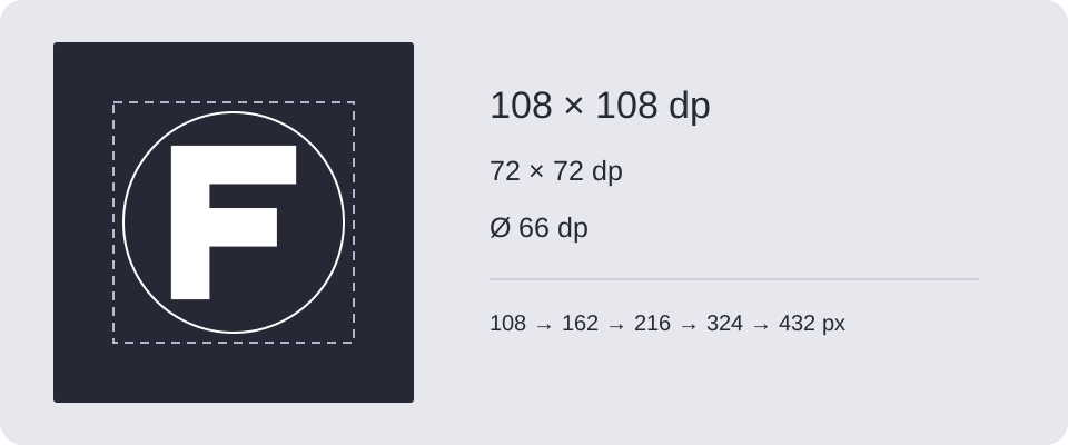
An Android launcher can crop the same app icon into several shapes. A logo that looks balanced in a square may lose its corners inside a circle. Prepare the artwork with that crop in mind before exporting all densities.
Foreground, background and safe zone
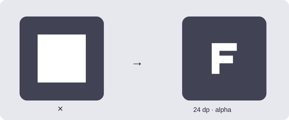
An adaptive icon combines a foreground with a background. Android defines a 108 × 108 dp layer and a central safe region measuring 66 dp across. Keep the essential mark inside that region; let the background extend to the edges. Do not bake a rounded outline into the source. These dimensions describe the adaptive layer, not the size of the icon on the home screen. See Android’s adaptive icon specification.
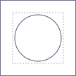
The downloadable grid is a reference overlay. Place it above your artwork in a vector editor, align both canvases, and hide the guide before exporting. The dashed square marks the 72 dp viewport; the circle marks the conservative safe area. Avoid treating a safe-area rectangle as permission to fill its corners with important details.
Generate the Android package
- Open Fox’s Icon Generator and choose text, clipart or your own transparent image.
- Add the Android output and select its preview.
- Choose a background color. Reduce the artwork size until the important parts survive both the circle and squircle previews.
- Next to Export, choose This project only, download the Android ZIP and extract it. All projects exports every added format; when there is more than one, the Android files are in the combined ZIP’s
android/directory.
The generator creates legacy PNGs and separate adaptive foreground resources. Its archive includes the following directories, using the default filename:
res/
  mipmap-mdpi/ … mipmap-xxxhdpi/
  mipmap-anydpi-v26/ic_launcher.xml
  mipmap-anydpi-v26/ic_launcher_round.xml
  values/ic_launcher_background.xml
README.txt
Install without breaking existing resources
Merge the contents of res/ into your app module’s src/main/res/. Review conflicts instead of replacing the entire directory: it also contains layouts, strings and other application resources. In the existing application element, set:
android:icon="@mipmap/ic_launcher"
android:roundIcon="@mipmap/ic_launcher_round"
These names assume the default export settings. If you choose another filename, use the references in the generated README. Keep the XML and PNG names together when copying the package.
Check the installed result
Test the installed app under more than one launcher shape. If the mark is cropped, adjust its scale rather than adding a rounded frame. If an old icon remains, check the manifest and selected build variant before blaming the exported image. An app flavor can supply its own resources.
For wallpaper-based colors, continue with the themed icon guide. A status-bar symbol needs a different export: see notification icons.
Safe area circle in the preview
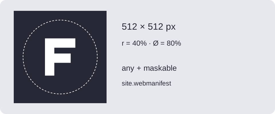
In Composition, enable Safe area circle. Use Circle diameter to set it from 20% to 100% of the icon’s shorter side; the default is 80%. Adjust the artwork’s scale and position while checking its distance from the circle.
The overlay is for preview only — it is not included in PNG or ZIP exports. Its settings are remembered in this browser but are not part of a shared project. Use the circle to judge spacing in the preview; its percentage diameter is not an adaptive-layer measurement in dp. Also compare the launcher masks and the reference grid described above.
Download and try it
Original examples by Fox, free to edit and use commercially. Guide diagrams are for reference; use the source SVG for export.