 Icons byFox
The developer’s field guide
Android themed icons: prepare a monochrome layer
Create a clear monochrome launcher icon, export Android resources and check themed icons on a supported launcher.
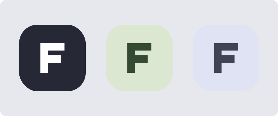
A full-color launcher icon and a themed icon solve different problems. The first preserves your palette; the second needs a recognizable silhouette after the launcher supplies its own colors. Start with a shape that works without gradients or color contrasts.
What the monochrome layer does
Supported launchers can use the adaptive icon’s monochrome layer when themed icons are enabled. This feature began with Android 13. Newer behavior, including automatic theming on Android 16 QPR 2, means a device may theme an icon even without a supplied layer. An explicit layer still gives you a deliberate shape. See Android’s current themed-icon behavior.
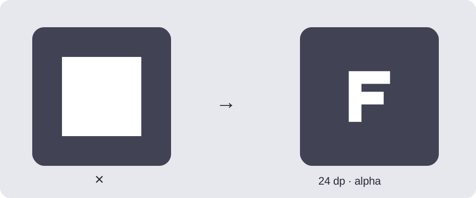
Our illustration uses one original silhouette in three palettes. It is a design example, not a promise that a particular launcher will choose those exact colors. Download the transparent source to experiment with spacing and scale.
Export it in Fox’s Icon Generator
- Add an Android output and select it.
- Use a transparent mark or a simple clipart. A photograph or an opaque square makes a poor silhouette.
- Enable Themed in the Android settings and inspect the preview.
- Download the Android ZIP. Keep the normal icon resources as well as the themed ones.
The generator derives the monochrome layer from the configured artwork; it does not create a separately art-directed logo. If internal details disappear, simplify the source. Use a project-specific source when other output formats need a more detailed mark.
Understand the exported files
With default names, the package adds ic_launcher_monochrome.png in each density folder. It also includes an Android 13 resource override:
res/mipmap-anydpi-v26/ic_launcher.xml
res/mipmap-anydpi-v33/ic_launcher.xml
res/mipmap-mdpi/ic_launcher_monochrome.png
… other density folders
The v33 XML references the monochrome image in addition to the foreground and background. Merge the complete res/ directory into the app module so all references resolve. If you rename the export, follow its README rather than copying names from this example.
Diagnose a missing or solid themed icon
First confirm that themed icons are enabled and that the launcher supports them. Then inspect the installed build’s resources, especially when using flavors. A preview in the generator does not change the phone’s launcher settings.
A solid square usually points to opaque artwork. Check the source on a checkerboard and remove its background. Thin holes that disappear at launcher size need to be widened in the source, not fixed by changing the system tint.
The themed layer is a launcher asset. For the status bar, use a notification icon. For the basic foreground/background setup, start with adaptive icons.
Safe area circle in the preview
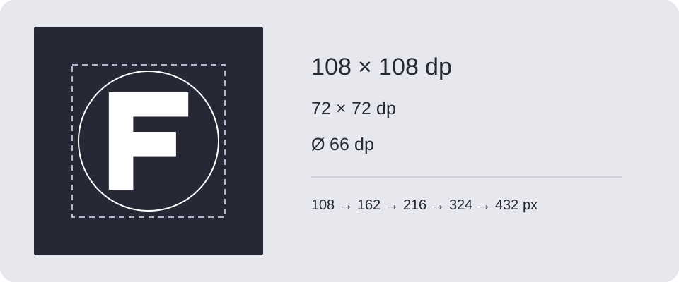
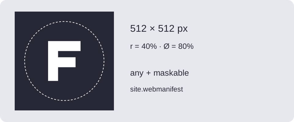
In Composition, enable Safe area circle. Use Circle diameter to set it from 20% to 100% of the icon’s shorter side; the default is 80%. Adjust the artwork’s scale and position while checking its distance from the circle.
The overlay is for preview only — it is not included in PNG or ZIP exports. Its settings are remembered in this browser but are not part of a shared project. Check that the essential part of the monochrome mark stays near the center. The circle does not change the monochrome layer or the launcher mask.
Download and try it
Original examples by Fox, free to edit and use commercially. Guide diagrams are for reference; use the source SVG for export.